# Charts, plots and maps
You can use charts and maps to visualize data from your Databar tables and then embed those visualizations in your Notion/Coda docs and custom websites. To use visualizations please follow the steps below.
Visualisation Creation Process
### Step 1 - Add your data
Create a table with your data source or Upload a CSV. Make sure to delete any unnecessary columns and fix column names to avoid confusion during the charting process.
### Step 2 - Create your first visualization
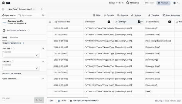
On the top right of your table, click on Share > Create a chart or map with this data. This should navigate you to the Chart Builder page.\
\
Click on + Trace to add a visual. Click Type and select the kind of visual needed from the selection panel. Once confirmed, select the fields from your table for the respective parameters of the visual.\
\
Your visual should immediately load up once all the parameters are filled.
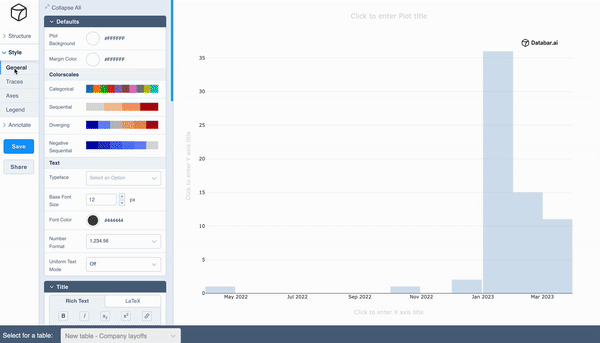
### Step 3 - Customisations
In the Styles tab, you can make all the design changes to your visual. There are 4 sub-tabs:
1. General: Making changes to the overall page (i.e. if multiple visuals, changes affect all) such as the background colour, adding text, changing text styling, and so on.
2. Traces: Making changes to individual visuals, such as bar width, step size, text, and start and end values.
3. Axes: Allows you to style individual axes such as text, range setting, tick markers, and much more.
4. Legend: Allows you to add/remove legends and perform styling on its components.
---
# Agent Instructions: Querying This Documentation
If you need additional information that is not directly available in this page, you can query the documentation dynamically by asking a question.
Perform an HTTP GET request on the current page URL with the `ask` query parameter:
```
GET https://docs.databar.ai/using-databar/charts-plots-and-maps.md?ask=
```
The question should be specific, self-contained, and written in natural language.
The response will contain a direct answer to the question and relevant excerpts and sources from the documentation.
Use this mechanism when the answer is not explicitly present in the current page, you need clarification or additional context, or you want to retrieve related documentation sections.